Design / Language / DirectionTwo people. One point of view.
Design withsomething to say.
Marian Fusek Design & direction
Linda Krestanova Words & strategy
Seasoned minds restless work
No handoff between idea and execution
ENNUI is a creative duo for brands that need the way they look and the way they speak to come from the same place.
Move / Scroll
BRAND IDENTITY × COPYWRITING × CREATIVE DIRECTION × DIGITAL DESIGN × NAMING × BRAND SYSTEMS ×BRAND IDENTITY × COPYWRITING × CREATIVE DIRECTION × DIGITAL DESIGN × NAMING × BRAND SYSTEMS ×
BRAND IDENTITY × COPYWRITING × CREATIVE DIRECTION × DIGITAL DESIGN × NAMING × BRAND SYSTEMS ×BRAND IDENTITY × COPYWRITING × CREATIVE DIRECTION × DIGITAL DESIGN × NAMING × BRAND SYSTEMS ×
01
What we do
One idea. Everywhere.
We find the part nobody else can honestly claim, then make it visible, verbal and impossible to dilute.
Identity
The visual system, from first mark to final detail — built around one idea strong enough to hold everything together.
No relay race. No lost translation. No weakened idea between departments.
02
Selected work
A complete world.
Strategy, identity, language, packaging, imagery and digital — held together by one point of view.
03
The people
Similar mileage. Different instincts. Equal say in where the work goes.
Different instincts. The same intolerance for work that almost works.
Marian Fusek
Design / Creative Direction / Leadership
Twenty years into design, Marian still starts with the same question: what is the one thing this brand can own? He turns the answer into identities, interfaces and systems — then holds the creative standard until every part feels like it came from the same mind.
Independent creative director and designer. CCO / Creative at MIUNĀE.
STRV — Chief Design & Engineering Officer, Design Team Lead and Product Designer.
Linda finds the sentence that makes the whole thing make sense — then builds the language around it. Positioning, naming, voice and long-form copy become one coherent personality: precise enough to be unmistakable, direct enough to stand its ground and human enough to stay with you.
Independent words. CBO / Brand at MIUNĀE.
AIMS — Head of Content.
STRV — Senior Copywriter, then Communications Manager; brand voice, editorial strategy and company-wide communication.
Reporter in Brooklyn, editorial work in New York and a BA in Journalism.
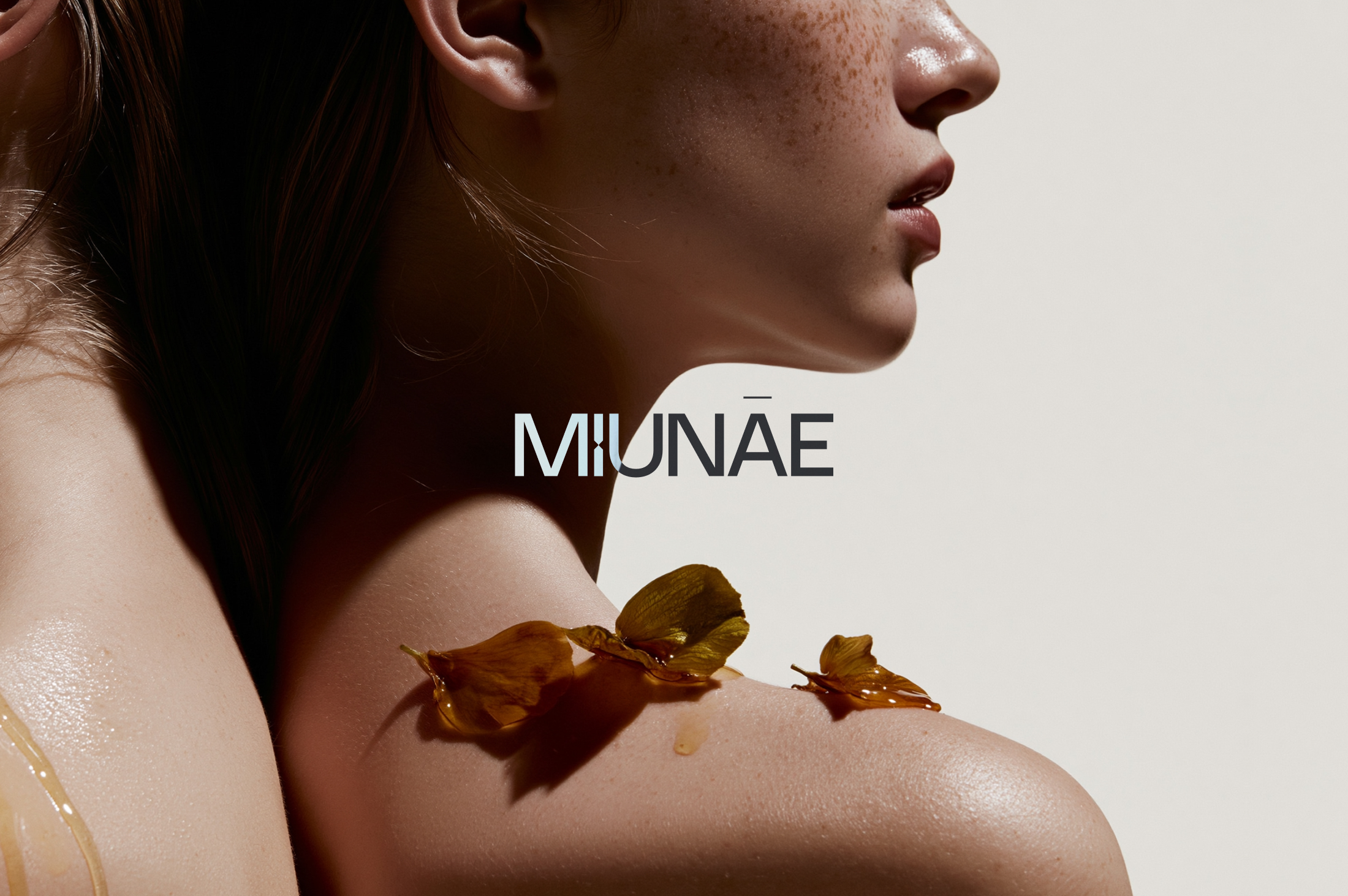
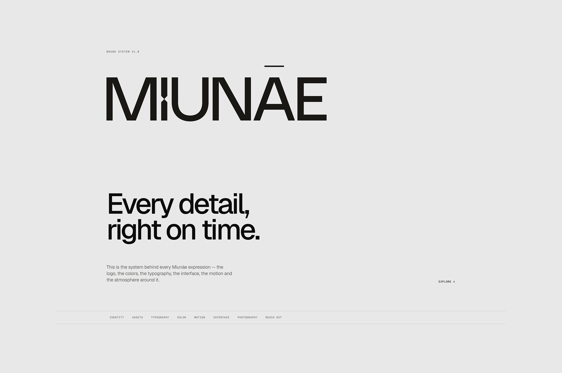
Eastern European beauty, made in Romania — a complete brand built around time, potency and standards.
The project
Build a beauty brand with nothing borrowed.
MIUNĀE began with Romanian heritage, a grandmother’s remedies and a refusal to accept diluted skincare. The work turned that truth into one coherent world.
Scroll to enter ↓Opening film / Brand atmosphere01 / The organizing idea
Nature has its own clock. We built the brand around time.
The hourglass became more than a mark. It became the logic behind the visual system, the pace of the language and the tension between polished surfaces and living material.
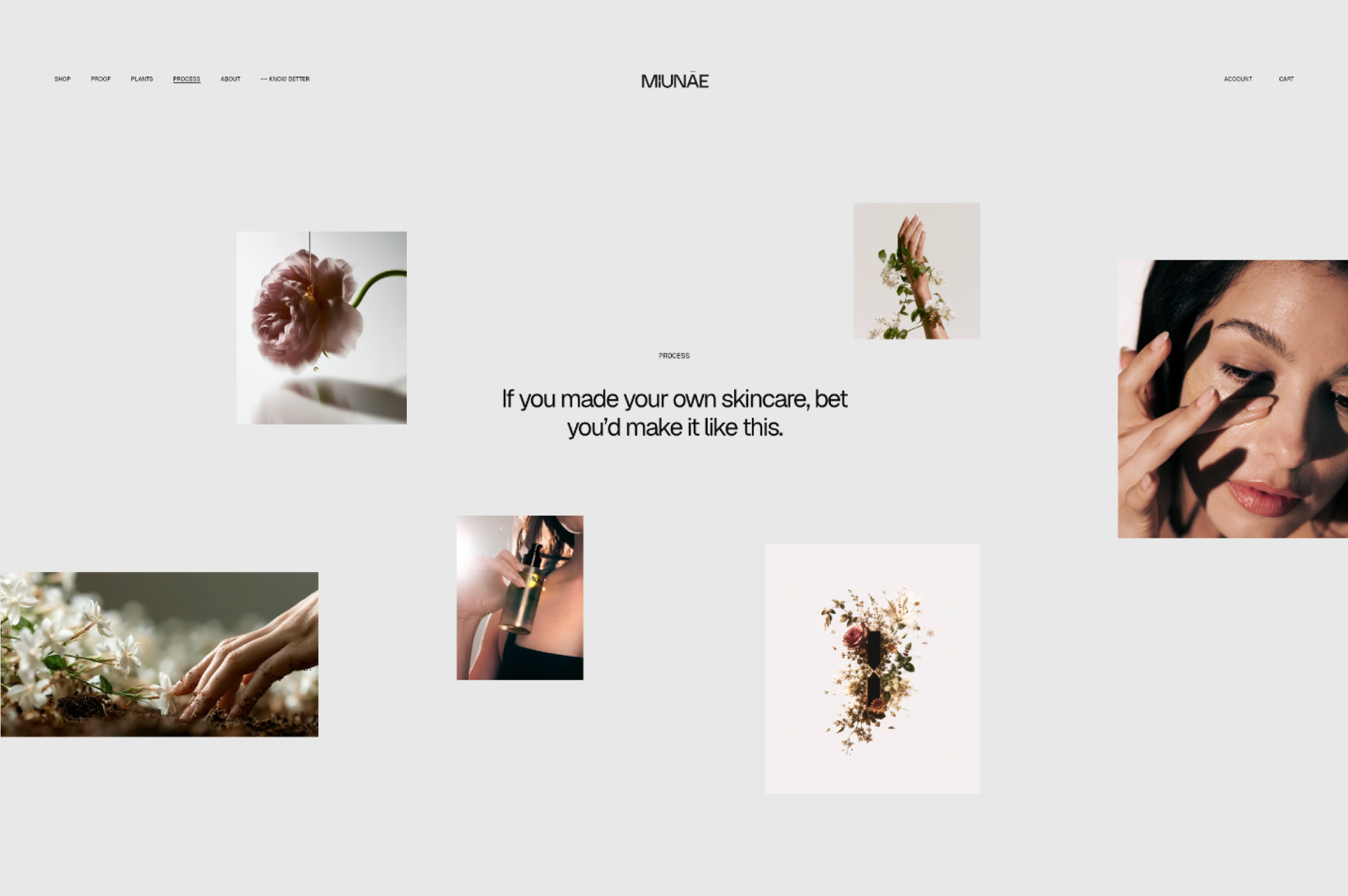
02 / Identity into experience
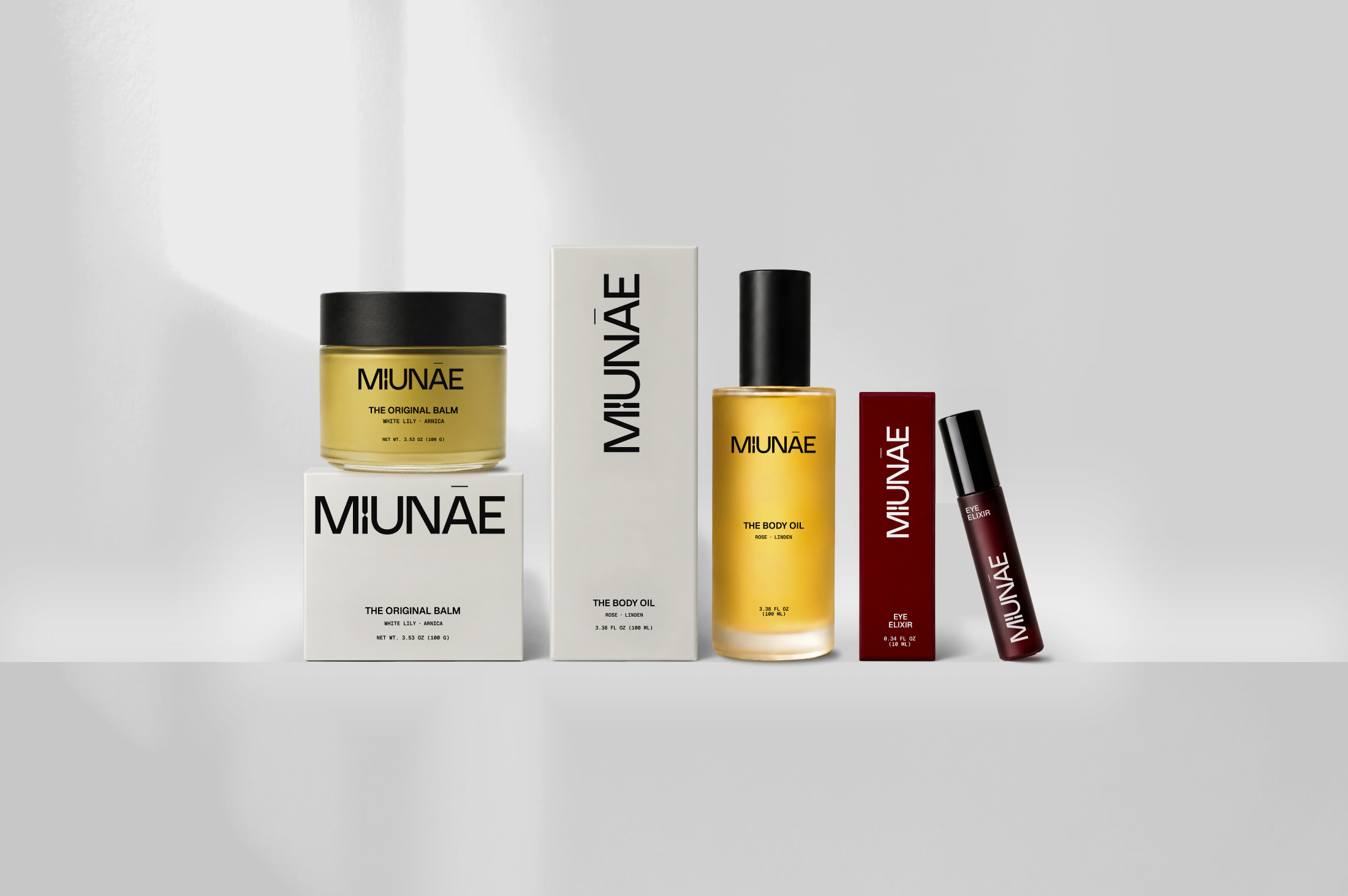
A mark designed to keep working.
The identity stays restrained enough to carry product education, but distinct enough to hold its own in packaging, motion and campaign imagery.
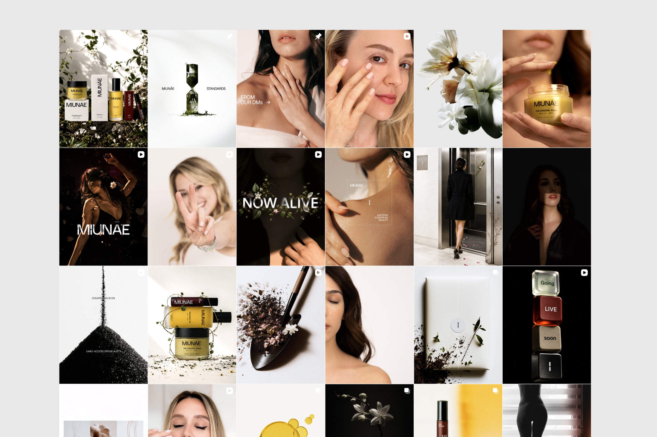
Digital02Social03
You’re gonna wanna feel this.
The strongest line in the system: intimate without being soft, confident without shouting and sensorial without losing credibility.
03 / The visual world
Elegant on the surface. Alive underneath.
Clean architecture meets soil, petals, oil and overgrowth. The contrast makes the brand feel contemporary without erasing where it comes from.
Linda’s approach: a voice with standards.
The copy keeps the emotional truth of inherited remedies while refusing the soft-focus language that dominates skincare. It had to be sensorial, informed and certain.
01
The tension
Heritage without nostalgia. The brand carries memory and origin, but never performs folklore or leans on old-world romance as a shortcut.
02
The voice
Direct, intelligent and physically grounded. The language names texture, feeling and standards clearly — then gets out of the way.
03
What we refused
No vague luxury promises. No trend-bait wellness vocabulary. No poetry that floats away from the product and what it actually is.
04
How it scales
The same personality moves from founder story to packaging support, product education, social captions and launch films without becoming repetitive.
04 / The system
One truth. Many forms.
Every output returns to the same center: time, tactility, potency and the confidence of Eastern European beauty.
Case study / 02AIMS / Digital system
AIMS
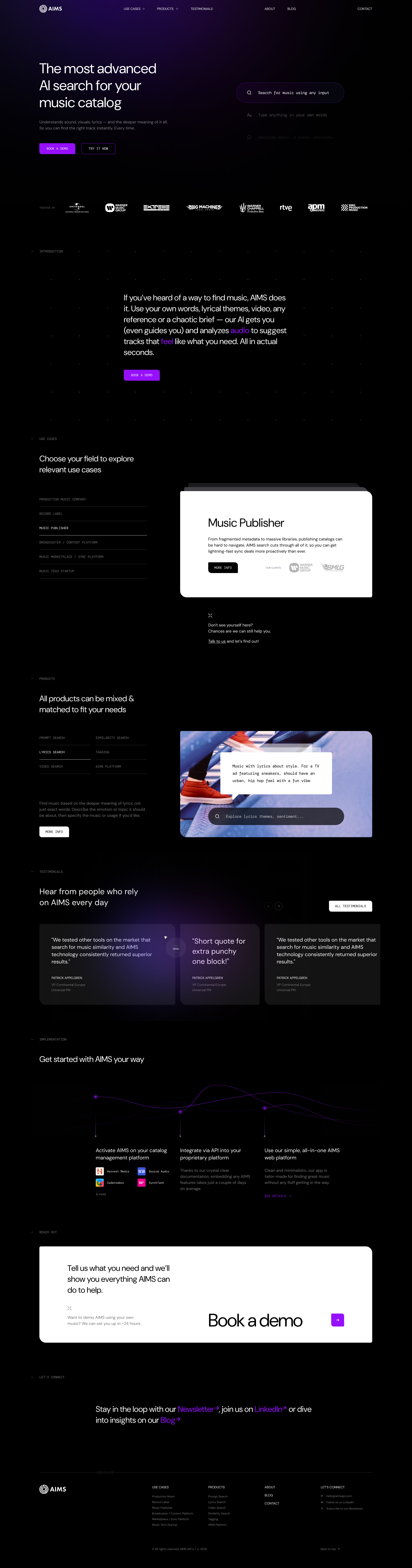
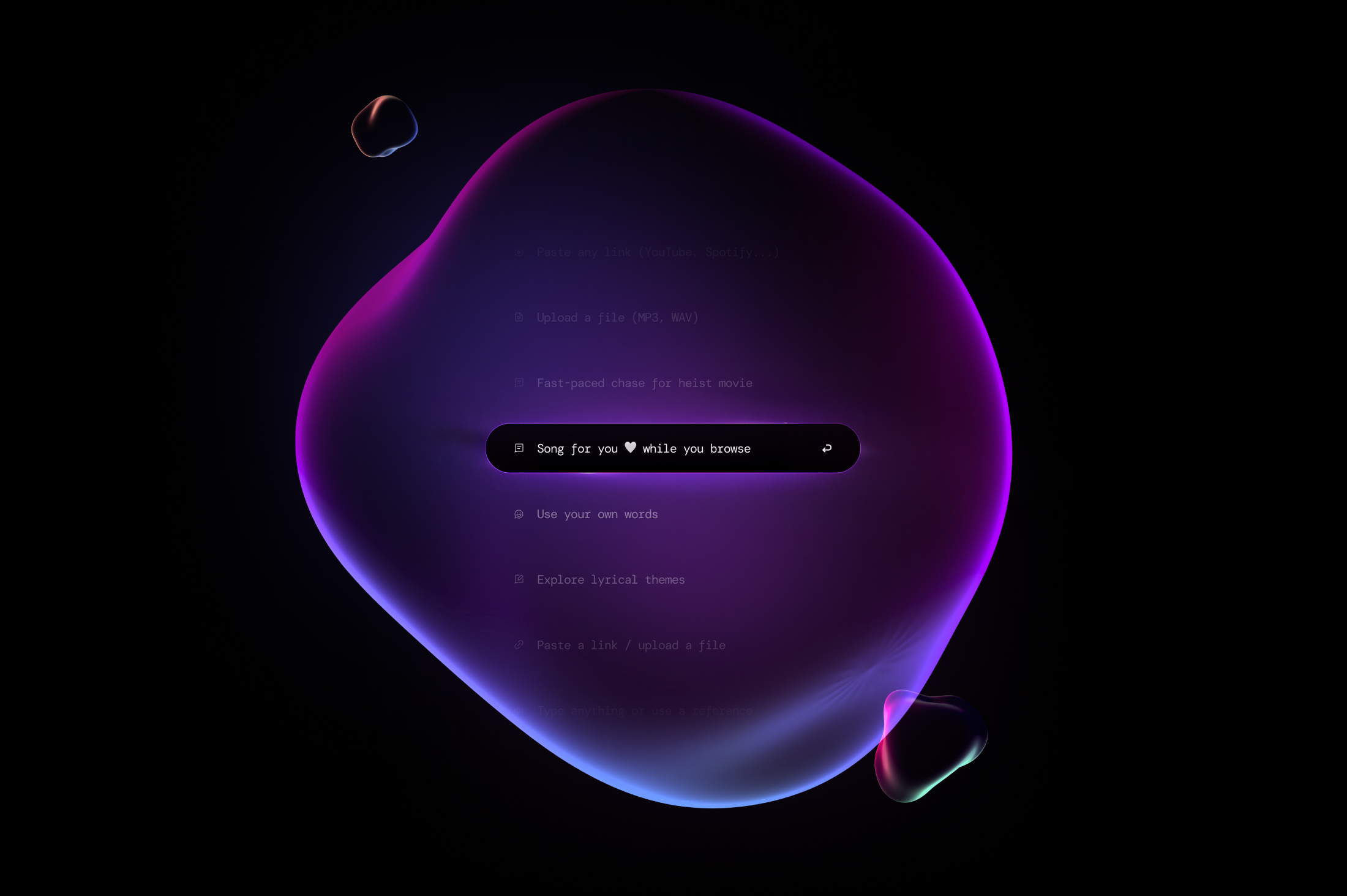
A clearer digital story for a technically advanced product — designed to make depth feel immediate and easy to trust.
The project
Make technical depth feel immediate.
The interface and language needed to explain a sophisticated product without making the experience dense, generic or overworked.
Scroll to enter ↓Opening motion / Homepage lead-in01 / The brief
Complex product. Calm handling.
The system reduces visual and verbal noise, letting the product’s intelligence show through without explaining every technical detail at once.
AIMS / Live page view
Linda’s approach: less explanation.
AIMS needed product language that respected the intelligence of the tool while lowering cognitive load. The copy’s job was to orient, not perform.
01
Lead with value
The clearest user benefit appears first. Technical depth follows only when it earns its place and helps the person make the next decision.
02
Calm, exact, modern
The tone avoids startup hype and dense feature dumping. Short sentences do the work, then leave the product room to demonstrate itself.
03
UI copy that disappears
Labels and microcopy guide behavior without becoming another visual layer users have to process.
04
One message system
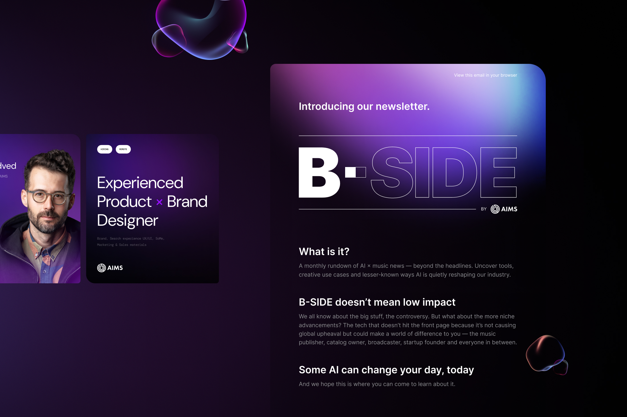
Website, sales materials and social previews inherit the same hierarchy so the brand remains clear wherever the story begins.
Social system / 01—03
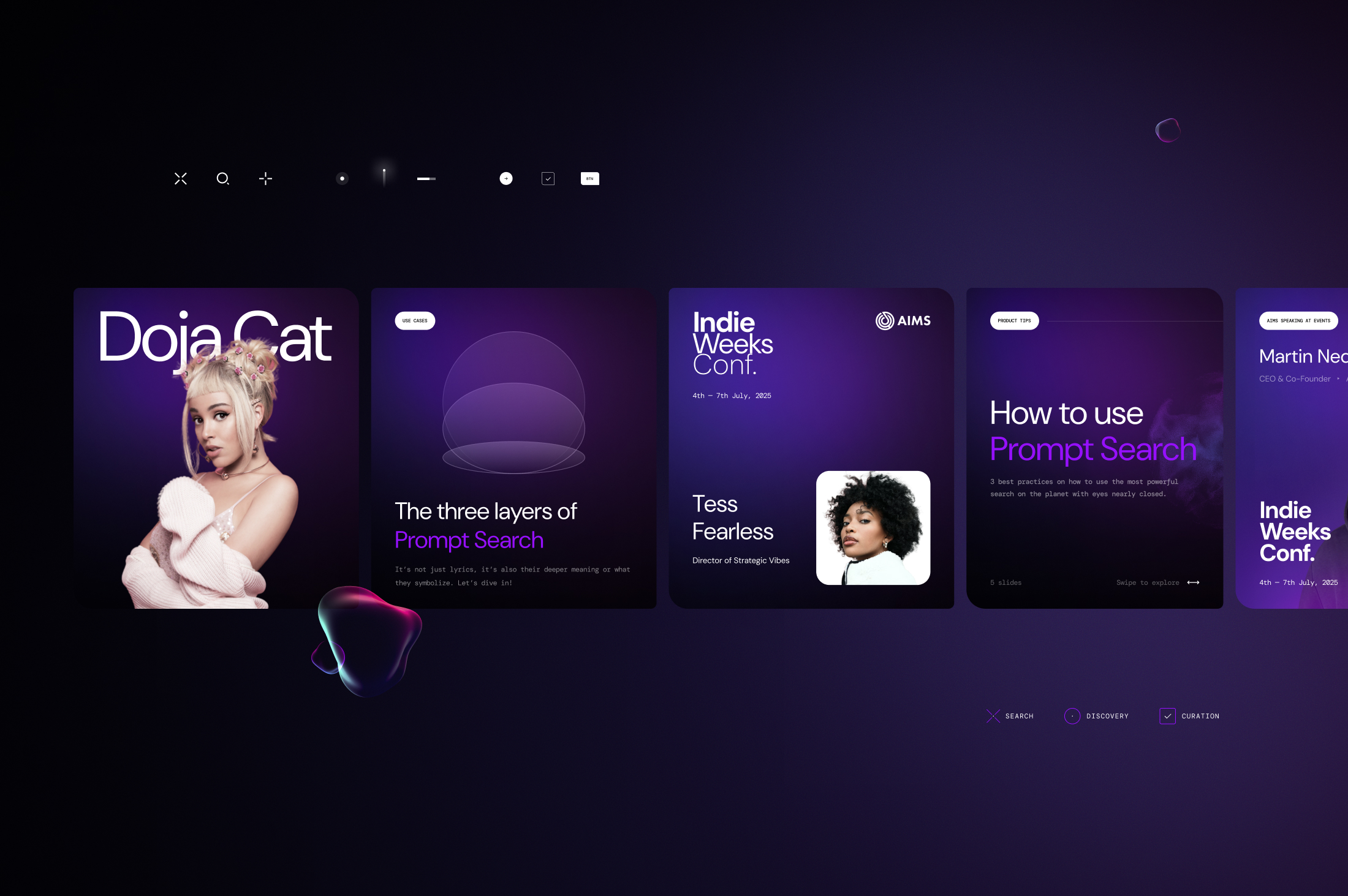
The same logic, outside the site.
Three connected frames, designed to sit edge to edge. Drag the sequence directly; each image stays complete while the next one waits just beyond the viewport.
01 / Social system02 / Social system03 / Social system
01 / 03Drag horizontally—
04 / One more touchpoint
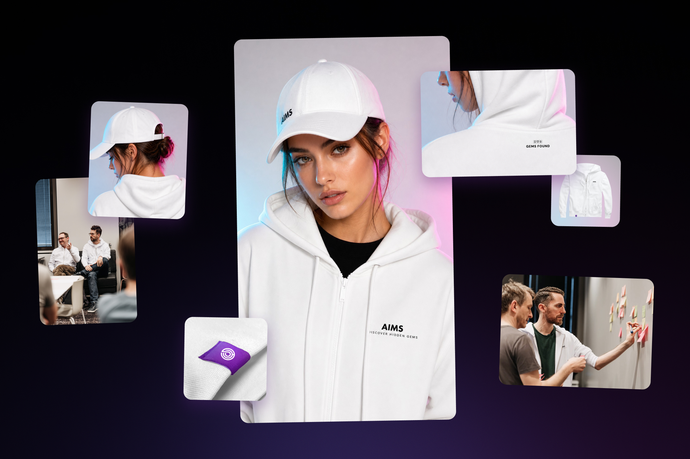
The system leaves the screen.
The final preview is deliberately quieter and smaller. It shows the system moving into a physical context without losing the same hierarchy, restraint or recognition.